How I Redesigned Sophia
Sophia was a floating chat button that treated all eight user types the same. I redesigned her as the contextual intelligence layer running across every surface of the product. Here's how.
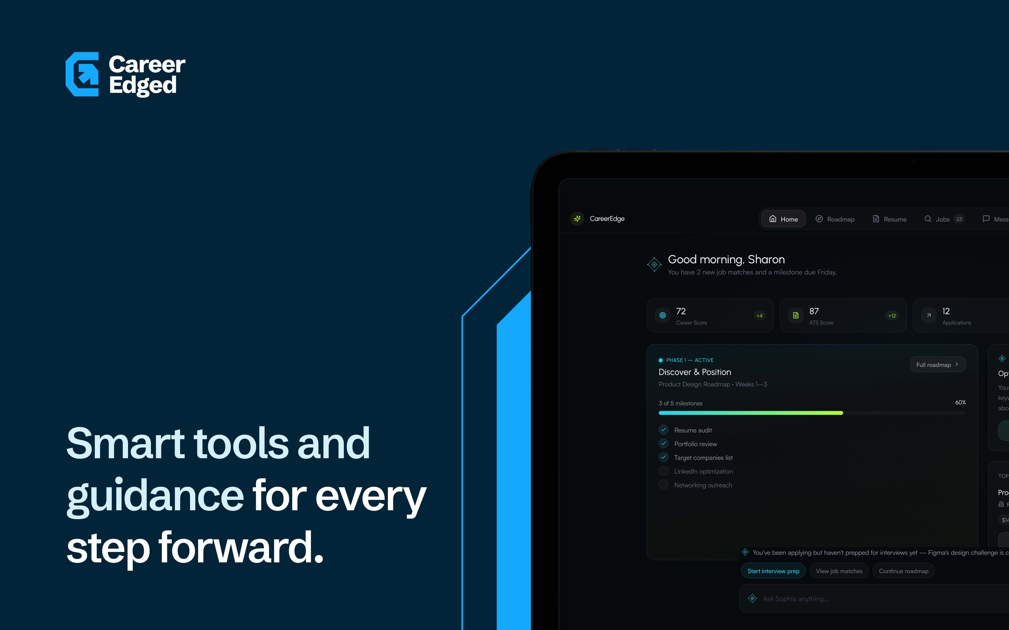
When I first opened the product, Sophia was a circle in the bottom right corner.
Click it, a chat drawer opened. Type a question, get an answer. She was the same for all eight user types. No awareness of where you were in the product, what you were trying to do, or what the system already knew about you. She was a search bar with better branding.
mKy Q0Dwiqi
What a generic chat button costs in a multi-role product
A chat interface puts all the cognitive load on the user.
You have to know what to ask. You have to know what the product can do. You have to formulate a query in a moment when you might not have the vocabulary yet. For a power user who knows the product well, this works. For a government official in an NGO using a career management system for the first time, it does not.
CareerEdge had eight user types — job seekers, coaches, employers, parents, students, governments, NGOs, guides. Each with their own context, their own goals, their own relationship with AI. A single chat interface serves none of them particularly well. It is a compromise that satisfies no one.
CareerEdge already had the data. Career phase, upcoming deadlines, recent activity, role type — all in the system. Sophia was not using any of it.
[THINKING]CareerEdge already had the data. Career phase, upcoming deadlines, recent activity, role type — all in the system. Sophia was not using any of it.
[THINKING]The question was never 'what can she answer?' It was 'what does she already know?'
This is the difference between a reactive interface and a proactive one. A reactive Sophia answers questions. A proactive Sophia surfaces what matters before the user has to articulate it. For a product trying to serve someone managing a career transition with a deadline in three weeks, proactive is the only useful mode.
Sophia did not need to wait for a question. She had the data. She needed to read it and act on it — before the user had to ask.
1%< B!PSu8{*
From chat button to contextual layer
She runs across every surface now. Not just the bottom right corner.
On the career roadmap, she knows your current phase and your nearest deadline. On the application tracker, she flags what has gone stale. On the coaching dashboard, she prompts the next scheduled action. On the employer dashboard, she surfaces active candidates who match open roles. She does not wait to be asked. She reads where you are and acts on it.
The chat interface is still there. It is the fallback — for when she gets it wrong, or when a user has a question she did not anticipate. But the primary mode is not chat. It is context.
Going from a chat button to a contextual layer sounds like a small design change. It rewrote most of the interaction design across the product.
[THINKING]Going from a chat button to a contextual layer sounds like a small design change. It rewrote most of the interaction design across the product.
[THINKING]bj0 Er0R ccnL
Eight user types × 33 features
The complexity was not in one surface. It was in holding all of them at once.
Sophia's tone on the job seeker dashboard had to match Sophia's tone on the employer dashboard. Her guidance on the coaching surface could not contradict her guidance on the career roadmap. If I changed how she handled an edge case on one user type, I had to trace that decision through seven others.
That was the most demanding part of the whole project. Not the design, but the systems thinking required to keep it coherent across eight contexts, 33 features, and a product that was still being built while I was redesigning it.
She had to be optional. Not everyone trusts AI.
The team had one firm requirement from the start: Sophia had to be optional. Some of their users are not comfortable with AI. Some are in contexts — government agencies, NGOs, users sensitive to how AI handles immigration and employment language — where an AI-driven interface raised valid concerns.
So the product had to work completely without her. The sidebar, the more menu, the full navigation layer — all functional with Sophia ignored entirely. She is an enhancement, not a dependency. Both paths lead to the same place.
Designer and builder — I prototype to learn what's possible, then refine until it ships. Systems-thinking, hands-on builds, and interfaces people remember.
