Redesigned an 8-user career platform — navigation, AI layer, and full frontend build — without removing a single feature. Sophia went from a chat button to the contextual intelligence running the entire product.
CareerEdge came through a referral from a previous client. The backend was robust. The infrastructure was solid. The features were extensive. The problem was everything the user actually touches.
When I got into the dashboard for the first time, it was overwhelming and disorienting. Nothing had hierarchy. Everything competed for attention. It looked like what it was — a product built for functionality, not for use.
During our first calls I learned the full scope: eight user types, each with their own dashboard, their own features, their own goals. I asked for a PRD and they did not have one. I suggested they ask their coding agent to generate one from the existing codebase. What came back confirmed what I suspected — this was a genuinely robust system. The problem was that nobody had designed how people would actually use it.
The brief was complete: overhaul the UI and experience across all eight user types. The constraint was firm — nothing could be removed. Every feature had to ship.
[THINKING]The brief was complete: overhaul the UI and experience across all eight user types. The constraint was firm — nothing could be removed. Every feature had to ship.
[THINKING]Numbers like that describe load: every role multiplies mental models, navigation hooks, and permission edges. Without a spine, the product does not feel feature-rich. It feels like homework with no teacher. That is the gap my work targeted.
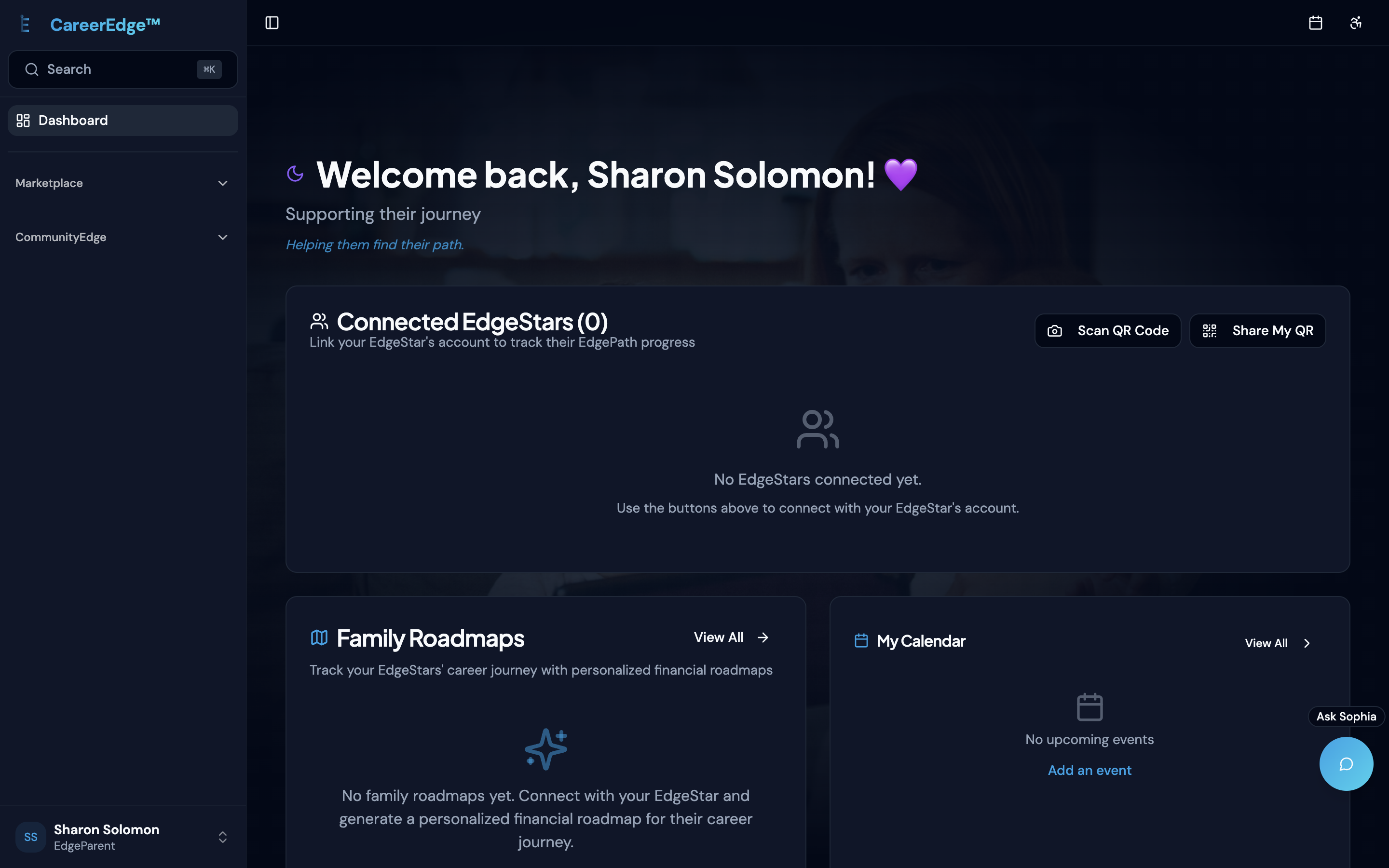
Job seekers, coaches, employers, parents, students, governments, NGOs, and guides — each with their own dashboard and feature set. The system was real. The story users could hold in their heads was not.
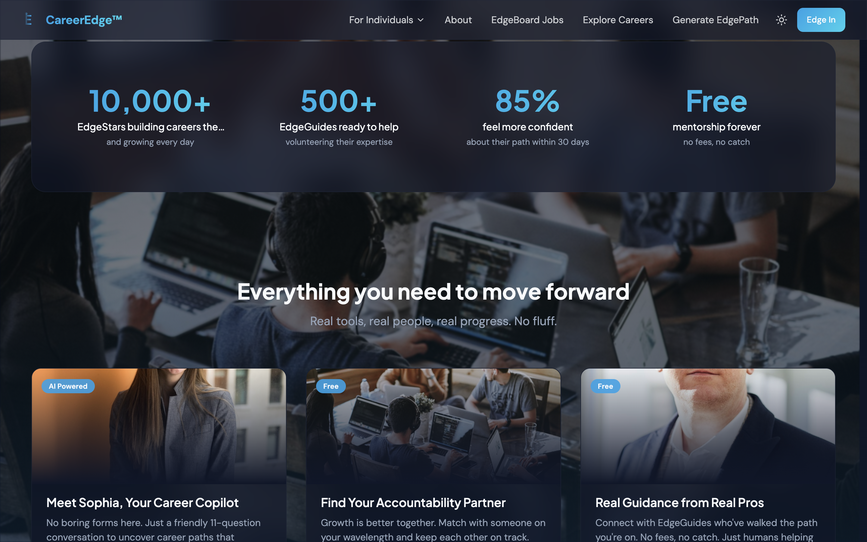
First — they needed a brand identity. There was no visual language, no color system, no typography direction, no tone. Everything downstream would be guessing without it. I referred a brand designer I knew and we moodboarded together across several calls to sync on vision. He delivered colors, fonts, visual language, logo and brand assets. That gave me a foundation to build on.
Second — I fed Claude the generated PRD alongside my custom product skills covering business strategy, UX and product design. We went through ideas, research and brainstorming. I used Figma Make to prototype multiple flows and variations, targeting navigation and onboarding first. The prototypes were not deliverables — they were thinking tools. A way to feel whether a direction was right before committing to building it.
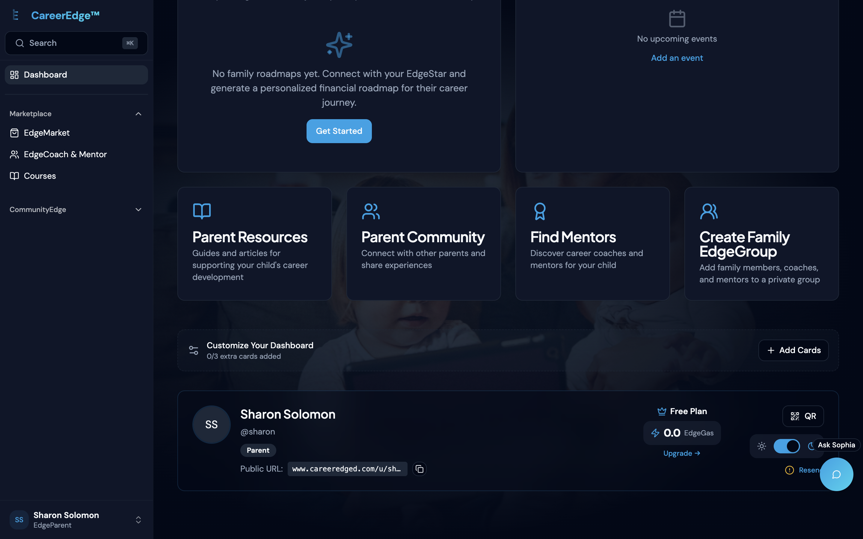
I logged into the parent dashboard and found that parents could not create their own career paths — only manage their children's. If a parent wanted to manage their own career, they needed a second account with a different email. That was a role architecture problem, not a UI problem. I flagged it.
[POINTING]I logged into the parent dashboard and found that parents could not create their own career paths — only manage their children's. If a parent wanted to manage their own career, they needed a second account with a different email. That was a role architecture problem, not a UI problem. I flagged it.
[POINTING]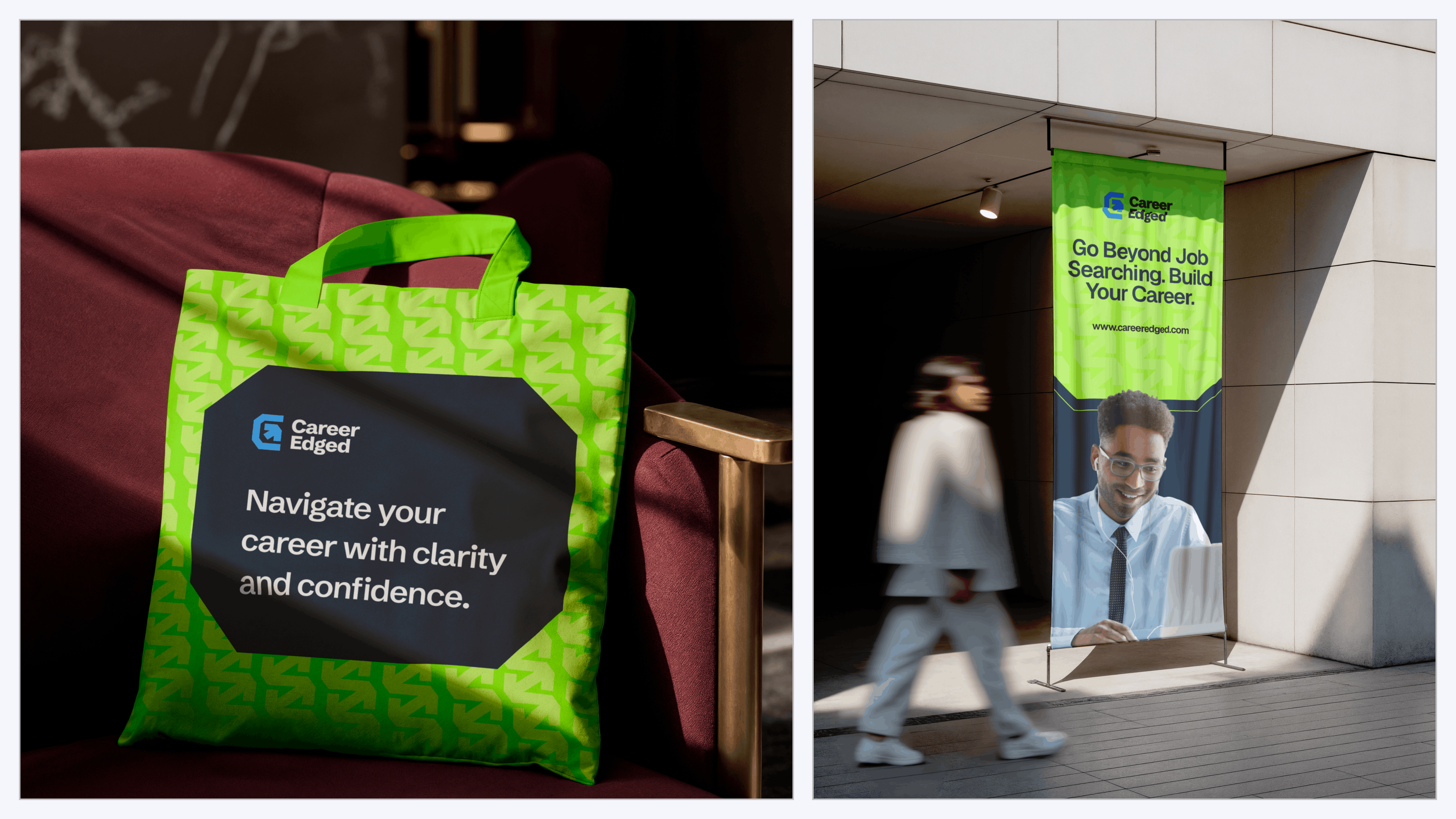
Applications
PCW]vgPAu#RX
Navigation that serves eight, and AI that reads the room
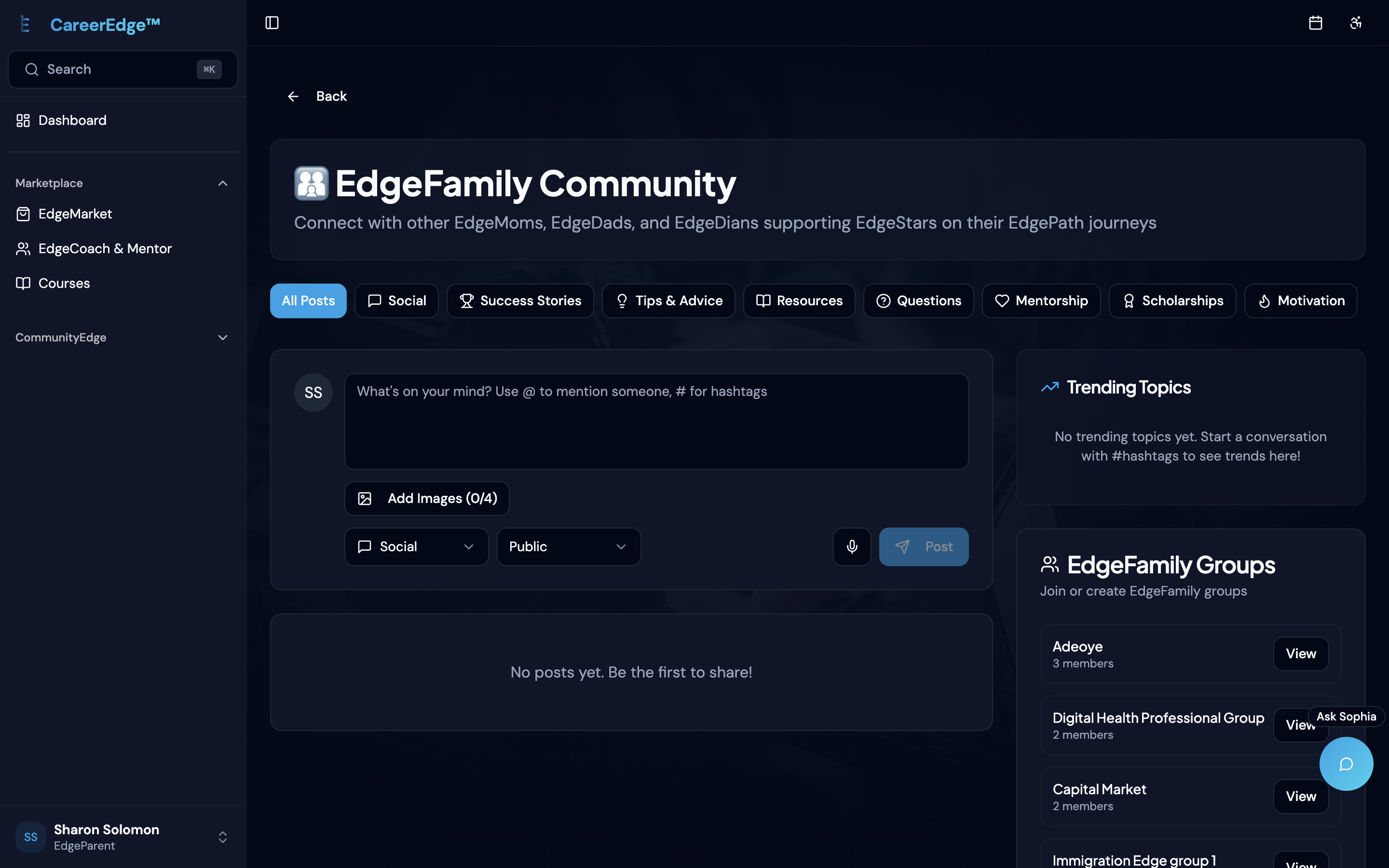
The original navigation was the source of most of the disorientation I felt on first use. Every feature, every link, every option — presented with equal weight. For a job seeker who just needs to update their resume and check their applications, seeing coaching management tools, employer dashboards and government reporting features is noise.
My first instinct was to strip it — remove features from the navigation entirely and let Sophia surface them contextually. The team pushed back. Some of their target users are not tech-savvy. Some are sensitive to AI. A navigation layer that requires you to know what to ask is not accessible to everyone.
They were right.
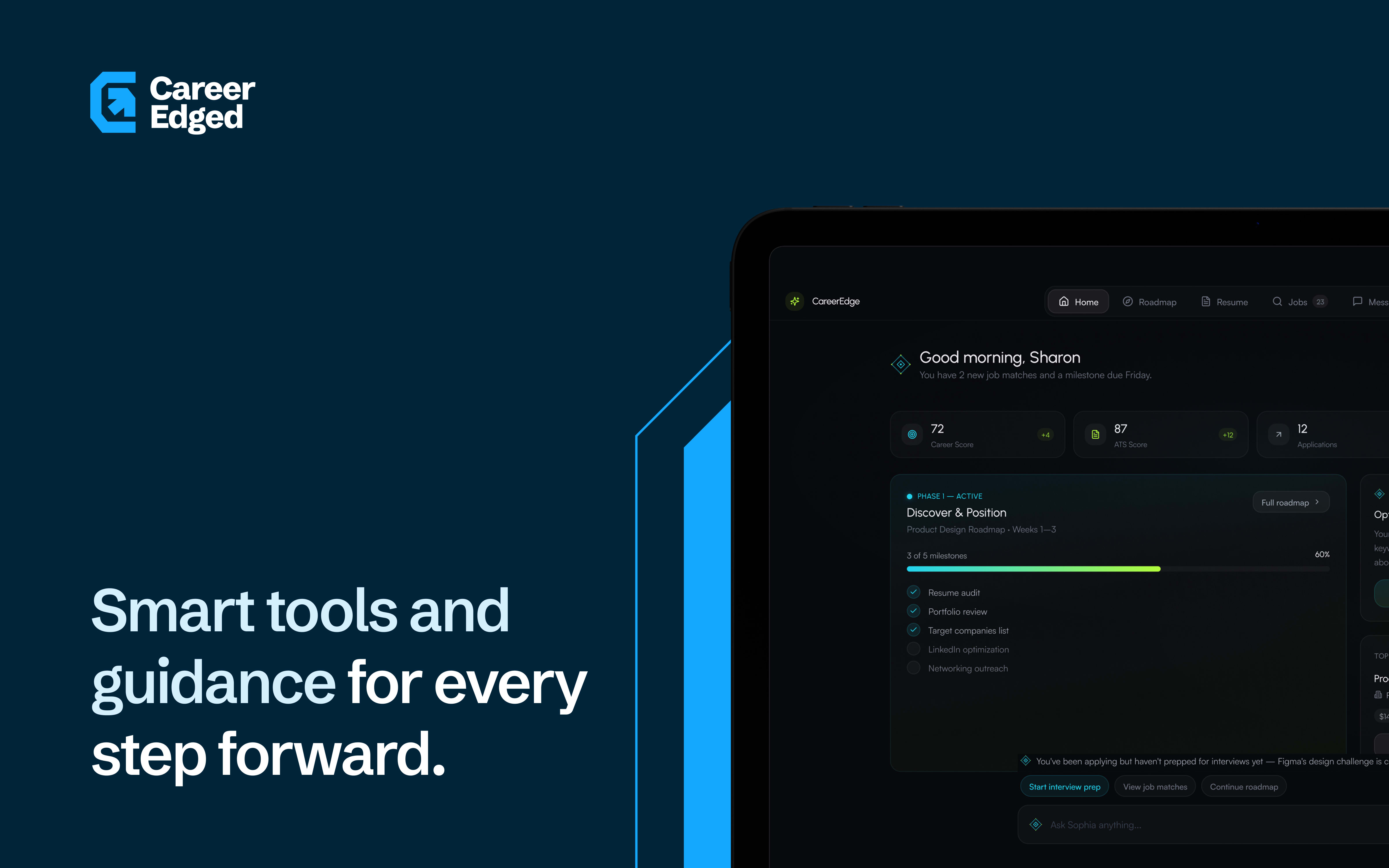
Main navigation comes down to five items per role — the five most relevant to what that user actually needs daily. A 'more' item hosts everything else. Sophia becomes the intelligence layer on top of both.
[THINKING]Main navigation comes down to five items per role — the five most relevant to what that user actually needs daily. A 'more' item hosts everything else. Sophia becomes the intelligence layer on top of both.
[THINKING]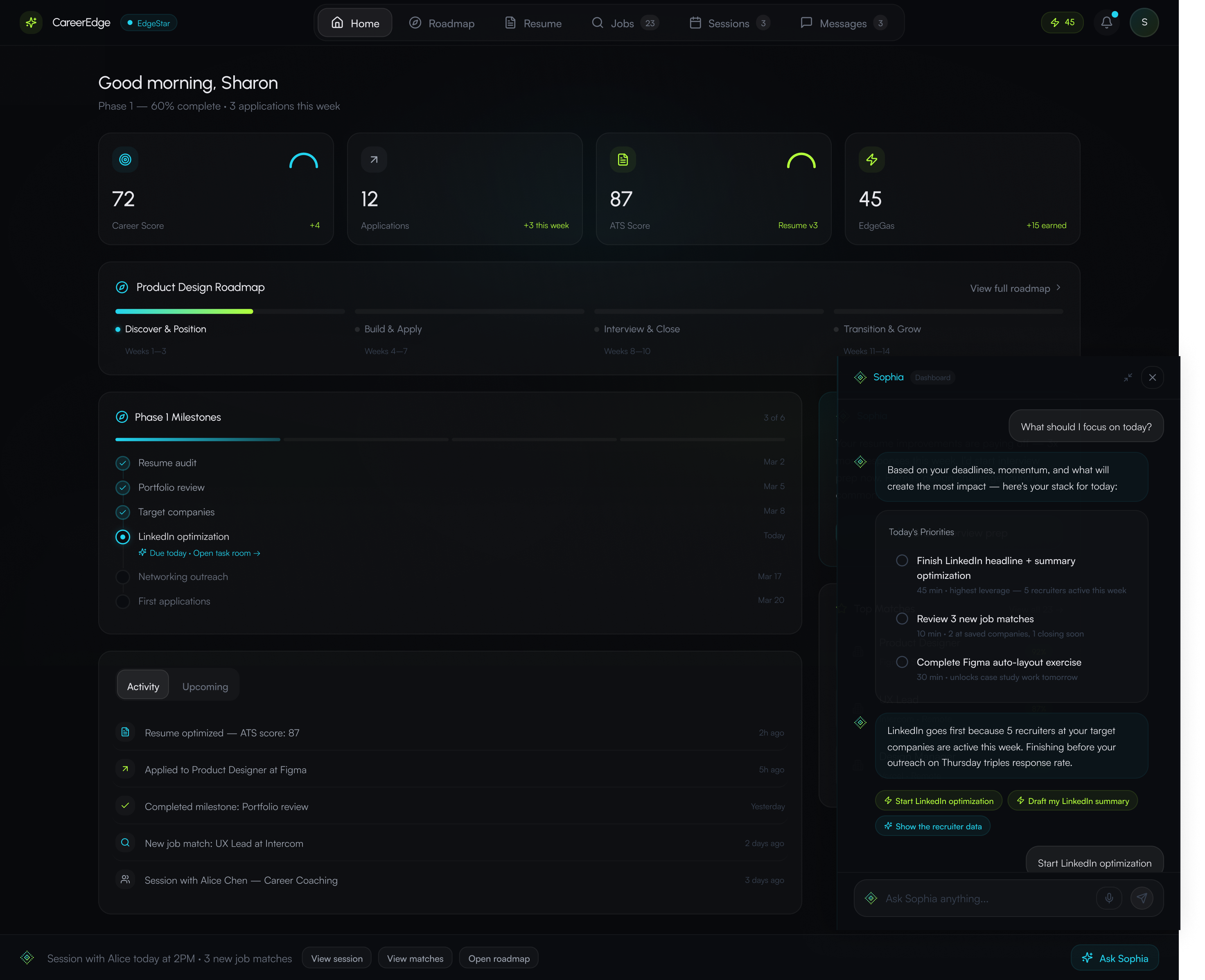
Sidebar — spatial memory
Sophia — guided action
More — full feature access
When I first looked at Sophia, she was a floating chat button. Click it, ask a question, get a generic answer. She treated all eight user types the same. No awareness of where you were in the product, what you were trying to do, or what the system already knew about you.
I redesigned her from a chat button into a contextual intelligence layer that runs across every surface of the product. On the career roadmap, she knows your current phase and your deadline. On the dashboard, she surfaces what is urgent today. She does not wait for you to ask — she reads where you are and acts on it.
The amount of information CareerEdge needed to present was significant — career data, application statuses, coaching schedules, financial tracking, skill assessments, job matches. For one user type alone. Sophia was my answer to information overload.
[THINKING]The amount of information CareerEdge needed to present was significant — career data, application statuses, coaching schedules, financial tracking, skill assessments, job matches. For one user type alone. Sophia was my answer to information overload.
[THINKING]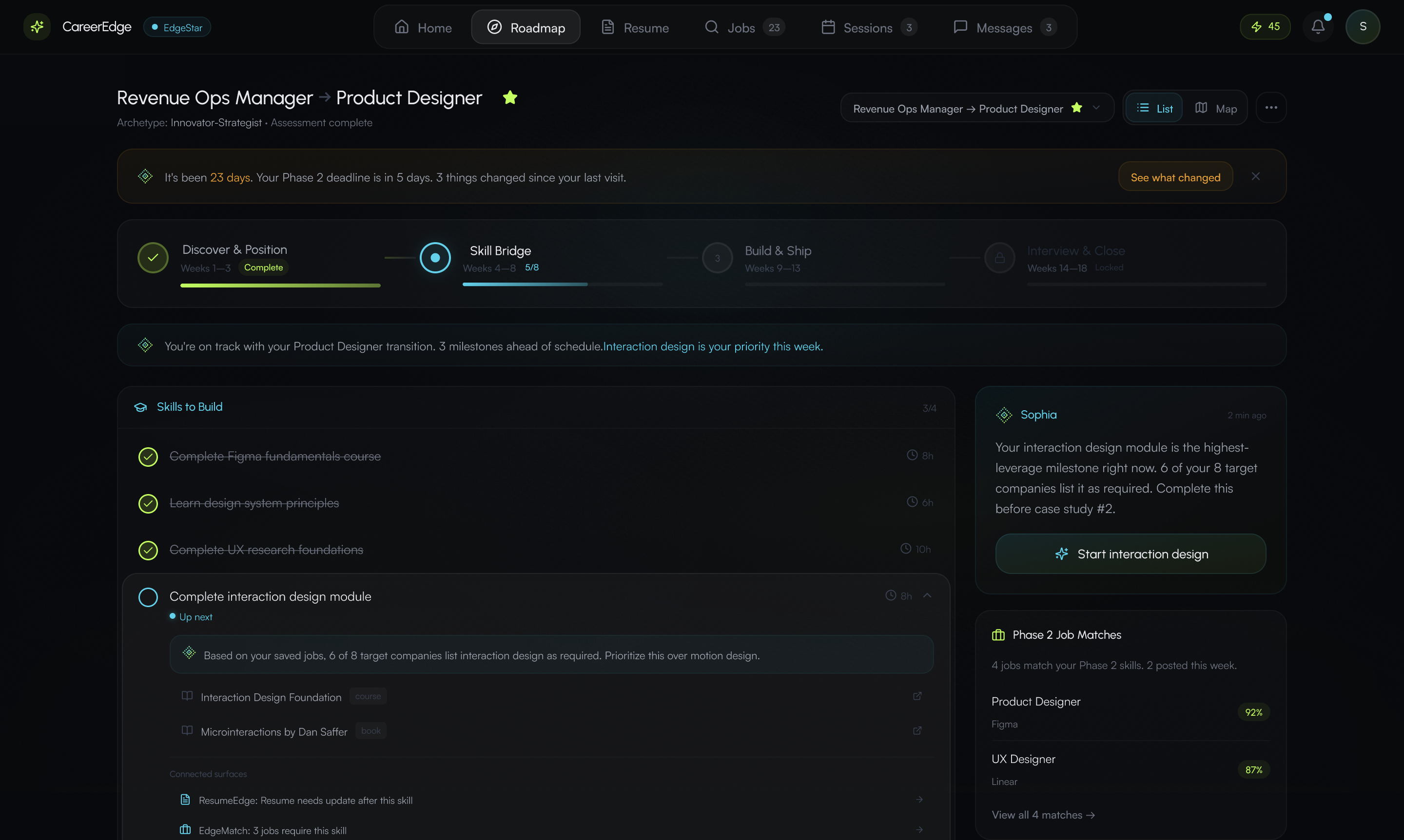
Sophia contextual strip on career roadmap — phase-aware guidance and next action
Contextualising Sophia across eight user types and over 33 features meant accounting for edge cases at a scale I had not worked with before. Her tone needed to stay consistent. Her guided interactions needed to be specific to the surface. She needed to maintain user context across the product so she was not asking the same questions on different pages. And every interaction she initiates had to reduce friction — not add a step.
The team agreed on this direction from the start. The compromise was ensuring Sophia was an addition to the navigation, not a replacement. Users comfortable with AI can do almost everything through her. Users who are not can ignore her entirely and use the sidebar. Both paths lead to the same place.

IMG-09 — Career roadmap
IMG-10 — Employer dashboard
IMG-11 — Coaching surface
EH<t]
One designer. Eight dashboards. Six weeks. Built in code.
Given the timeline — initially two weeks, ultimately a little over a month — I could not have designed eight user dashboards end-to-end in Figma and then built them. So I went from PRD to Figma Make prototypes to building directly in code. Every surface, every component, every interaction across all eight user types — built in the frontend.
The tools: Claude for strategy, brainstorming and code generation. Figma Make for rapid prototyping. Cursor for the build itself. My custom product skills for structured decision-making across UX, business strategy and product design. I worked alone on the entire build, collaborating with the product owner throughout.
Claude's service was unreliable for roughly two weeks during the project. There was a week where Claude told me features were built. When I tested them, they were not there. That is when I started using Git branches as checkpoints — every commit a state I could revert to when the AI's output did not match what it claimed.
[FRUSTRATED]Claude's service was unreliable for roughly two weeks during the project. There was a week where Claude told me features were built. When I tested them, they were not there. That is when I started using Git branches as checkpoints — every commit a state I could revert to when the AI's output did not match what it claimed.
[FRUSTRATED]Without that system, eight user types worth of badges, icons, tags and avatars become visual chaos. The discipline was not aesthetic — it was architectural. Color became a signal, not decoration.
Three tiers: role accent (one per user type), brand and semantic (cyan for Sophia and AI interactions, lime reserved exclusively for earned success moments), neutral gray for everything else. Every colored element had to earn its color.
Add: color system documentation — role accents, semantic colors (cyan, lime), neutral tier
Add: role × navigation model — which 5 items each user type sees, IA diagram
Add: edge case screen, state documentation, or before/after showing quality bar
EdgePath and EdgeMap were the two features the team was most particular about. They wanted many sub-features visible and accessible directly from the surface. My recommendation was to embed those interactions into Sophia — let her prompt those actions contextually while the user was actively working. We went back and forth and landed somewhere in between.
The product is US-based and the founders' personal experiences are tied to immigration. Given the political climate, there were valid concerns around the language used — around immigration, race and AI. We had to navigate that carefully in all the copy across the platform.
The hardest part was holding the entire system in mind while making decisions at the component level. Every decision I made on one surface could affect another. If Sophia's behaviour changed on the coaching dashboard, I needed to think through what that meant for the student dashboard, the employer dashboard, the parent dashboard. That kind of systems thinking at this scale was something I had not done before. It stretched me in ways I did not expect.
Building the frontend in code meant I needed to understand how the backend worked — not just the UI layer but how data flowed, how roles were authenticated, how features communicated across the system. This deepened my understanding of backend architecture in a way pure design work never could.
[THINKING]Building the frontend in code meant I needed to understand how the backend worked — not just the UI layer but how data flowed, how roles were authenticated, how features communicated across the system. This deepened my understanding of backend architecture in a way pure design work never could.
[THINKING]Entire frontend across all eight user types — redesigned and built in code. New navigation architecture. Sophia from chat button to contextual intelligence layer. 3-tier color system. Brand identity integrated end-to-end. Onboarding flows.
[NEUTRAL]Entire frontend across all eight user types — redesigned and built in code. New navigation architecture. Sophia from chat button to contextual intelligence layer. 3-tier color system. Brand identity integrated end-to-end. Onboarding flows.
[NEUTRAL]This was the most complex work I have done. It tested my ability to hold an entire system in mind while making decisions at the component level. It forced me to think about how Sophia's behaviour needed to stay consistent and contextual across eight user types and over 33 features. It deepened my understanding of backend architecture and how infrastructure decisions shape what is possible on the frontend.
And it confirmed something I have been building toward: a designer who builds in code does not just see the interface. They see the system. The constraints are different. The tradeoffs are different. The conversations with engineering are different when you understand what is actually happening beneath the surface you are designing.
I built this entire frontend alone, with AI, in a little over a month. Two years ago I could not have done that. The tools changed. I changed with them.
O2y&nZ#
WANT SOMETHING LIKE THIS?
Every project starts with a conversation. Let's talk about what you're building.