Redesigning both rider and driver apps for a Nigerian interstate transport platform — modern, simple, safe, without breaking the complex system already in use.
Urban is a transportation platform built to improve how Nigerians travel across states. The founder had a big, long-term vision — something that would outlive him and genuinely make travel safer, kinder, and more organized for ordinary Nigerians. The product team before me was mostly engineers, and the apps reflected that. The design was outdated, the flows were confusing, and the experience didn't match the heart and ambition behind the idea.
Urban is the personal product of a client I had already built JET for. He brought me in as a project manager. While managing those tasks, I kept running into the product's interface, and it was rough. Fragmented navigation, information that belonged together split across screens, a driver experience that made you hop between a homepage and a separate dashboard for no reason.
So I texted him and offered to take on the UI. He gave me access, and what started as a project-management contract became an end-to-end redesign of both sides of the product.
That origin matters, because it is how I work. I do not wait for a design brief to land. I find the problem, and I make the case for fixing it.
The Constraint That Shaped Everything
Before any redesign decision, one rule governed all of them: I could not overly disrupt the existing architecture.
This was pre-AI-assisted development for their team. Every structural change I proposed had a real cost in engineering time and money. So the job was not to redraw the product from scratch into something prettier. It was to find the highest-leverage changes, the ones that fixed the real confusion and risk, while respecting a system that was already partly built and expensive to move.
Designing within that boundary is the actual skill. Anyone can redesign with a blank canvas. Doing it inside a live system, where every change is a negotiation with engineering reality, is what shipping in an established company looks like. The team found the approach refreshing and simpler precisely because it was disciplined, not because it was unconstrained.
First, One Urban: The Design System
Before the feature work, I created and maintained a design system across the driver and rider apps, so the whole product felt like one Urban.
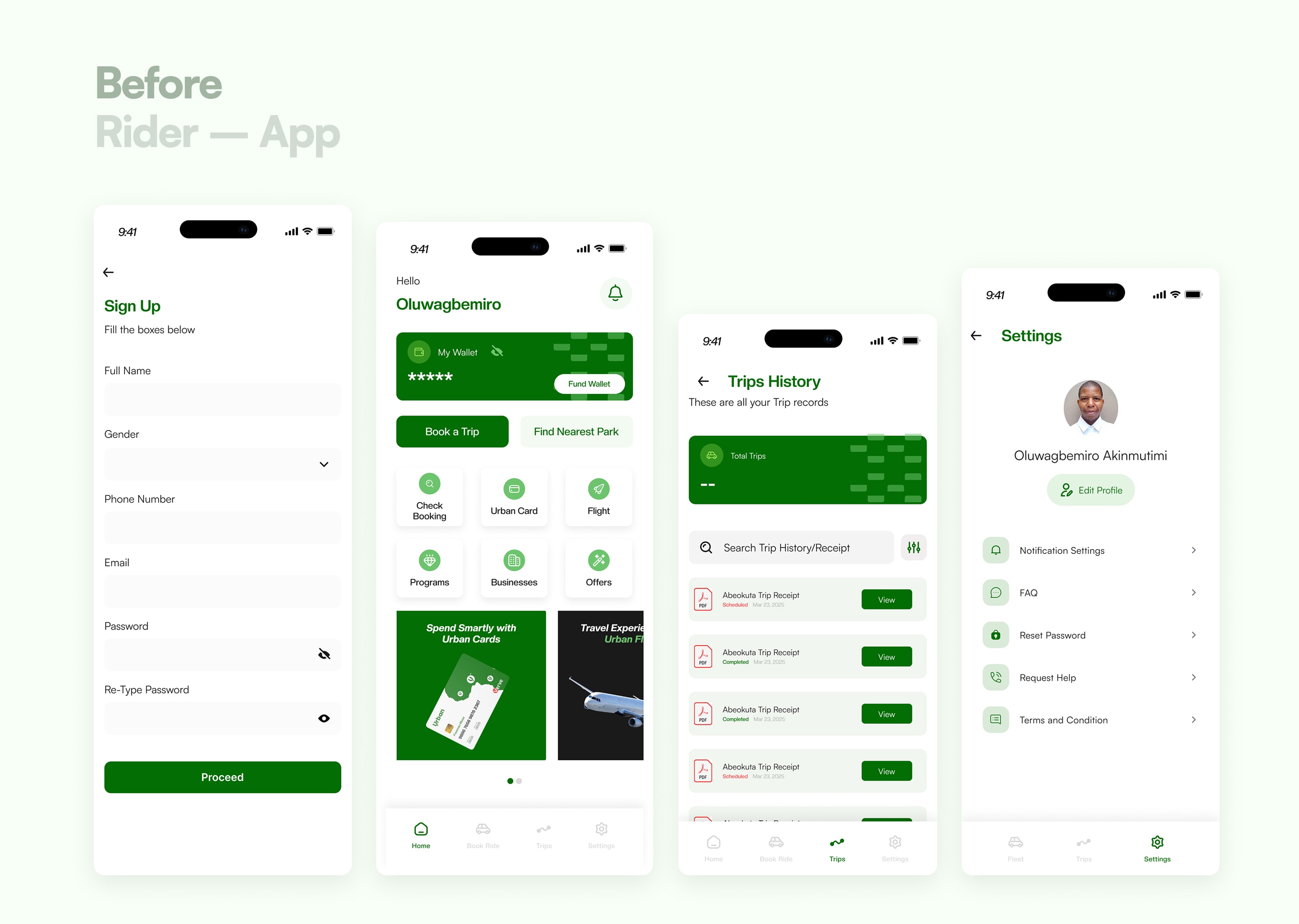
The starting state was inconsistent: typography that changed from screen to screen, uneven spacing, assets that did not match. Moving from the driver side to the rider side felt like moving between two different products built by two different teams. I tightened the typography, regularized the spacing, and unified the assets so that a single visual language carried across both sides. Modern, consistent, and recognizably one system.
This is the layer most people skip and then wonder why a product feels untrustworthy. A travel platform asking people to pay upfront for an interstate journey cannot afford to look stitched together.
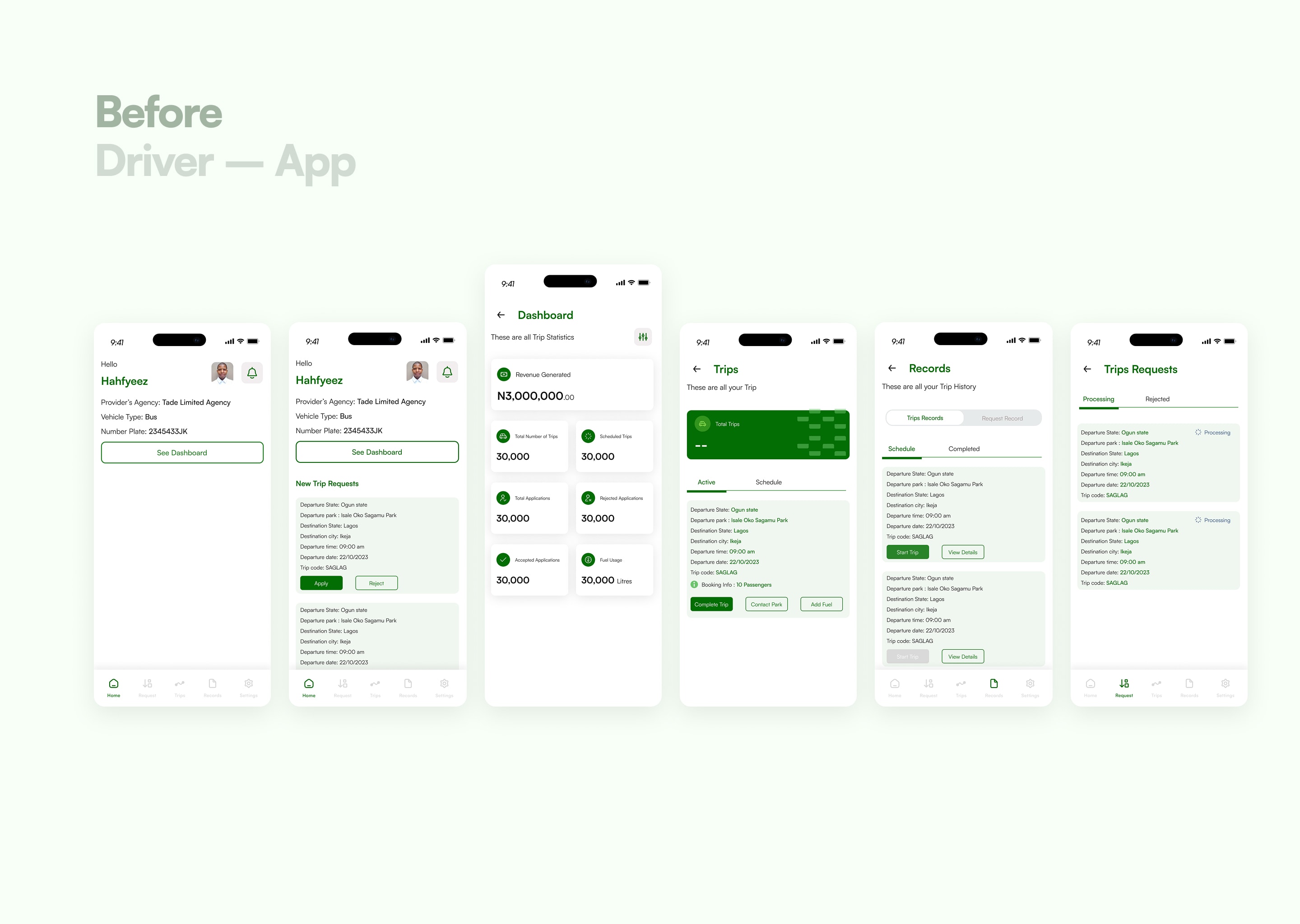
The Driver Side: Fixing a Fragmented Operation
The driver app was where the operational confusion lived, and where the redesign earned its keep.
Understanding how the operation actually runs
I started by asking how the business actually works, because you cannot fix a flow you do not understand. Do they have vehicles on the ground? How are rides assigned? The answers reshaped my assumptions. Drivers are employed by an agency on monthly pay, working set shifts, checking in around six or seven in the morning. They are not gig drivers picking up whatever comes in.
That one fact mattered. My first instinct had been a request-broadcast model, send a trip to whoever is available, first to accept wins. But these drivers are on shift, so trips are scheduled by the agency, and drivers indicate interest in the trips they want, morning shift, night shift, which vehicle. The product is a bidding-and-assignment system, not an availability-matching one. Designing the wrong model would have fought the business instead of serving it.
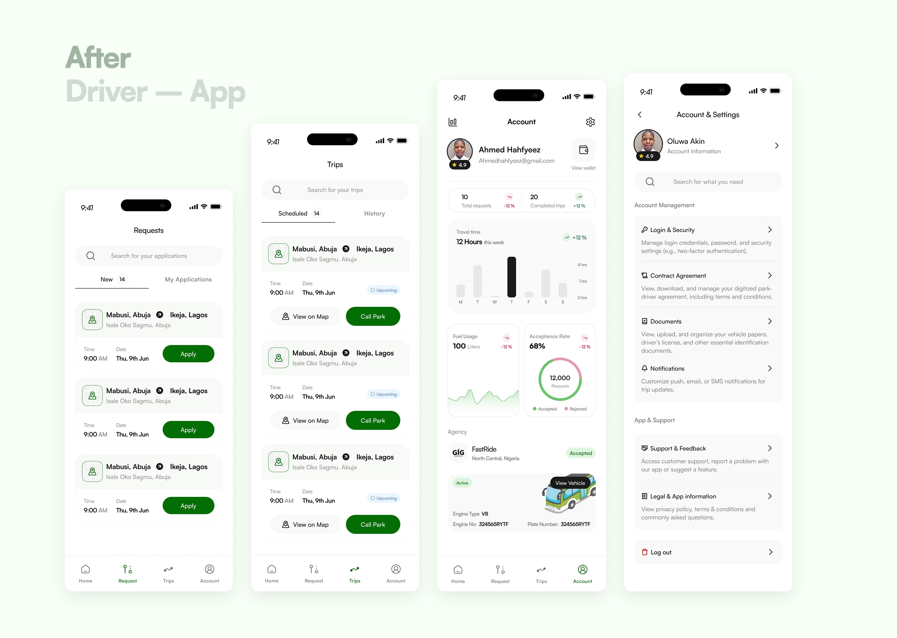
Collapsing three fragmented tabs into a real model
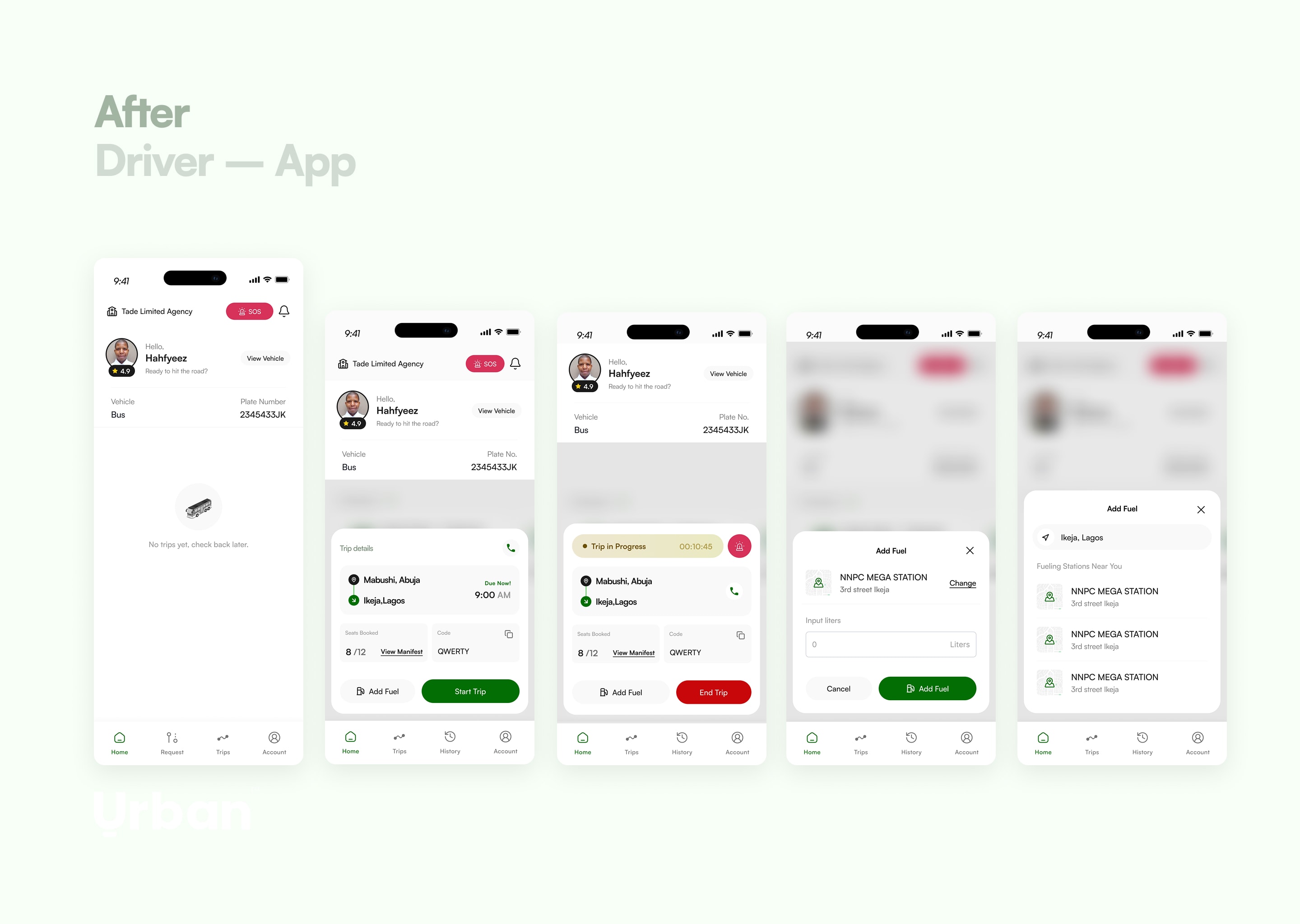
The navigation was the core problem. The driver app had five tabs, and three of them, trips, records, requests, were really the same thing in different states, with inconsistent language making it worse. "Trips" sometimes meant orders, sometimes meant completed journeys. The same concept had different names in different places.
I worked it back to a single mental model: a trip has two phases. It starts as a request, then it becomes a trip. A trip can be scheduled or active, and eventually all of it becomes history. There was no reason to split that one lifecycle across three tabs each with their own internal subdivisions.
To get the interaction right, I looked at how fintech apps handle records and states, because they live and die on showing many items in many states without becoming a mess, and at food-delivery apps, where an order moves through phases (ordered, received, en route, arrived) on one coherent surface. I borrowed the pattern where the most active item sits pinned at the top and drops into history once it resolves.
So I collapsed the navigation from five tabs to four (home, requests, trips, account), and restructured requests into "new requests" and "my applications." When a driver applies for a trip, it sits at the top of my applications as pending. If rejected, it drops to history and the top clears. If accepted, it moves to trips. One lifecycle, legible at every stage. I also pulled the next upcoming trip onto the homepage, so a driver opening the app immediately sees what they are heading to and when, instead of a blank screen.
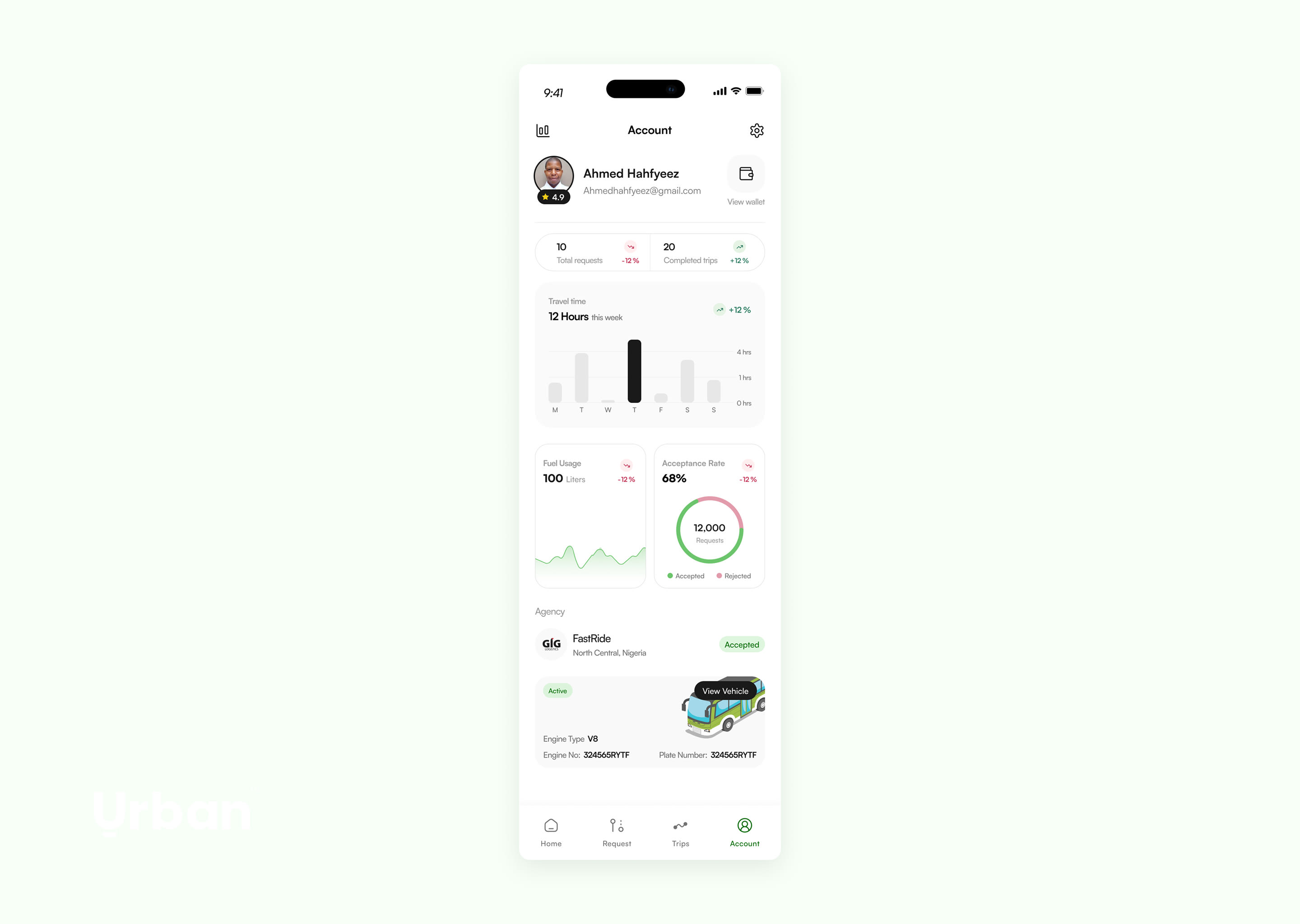
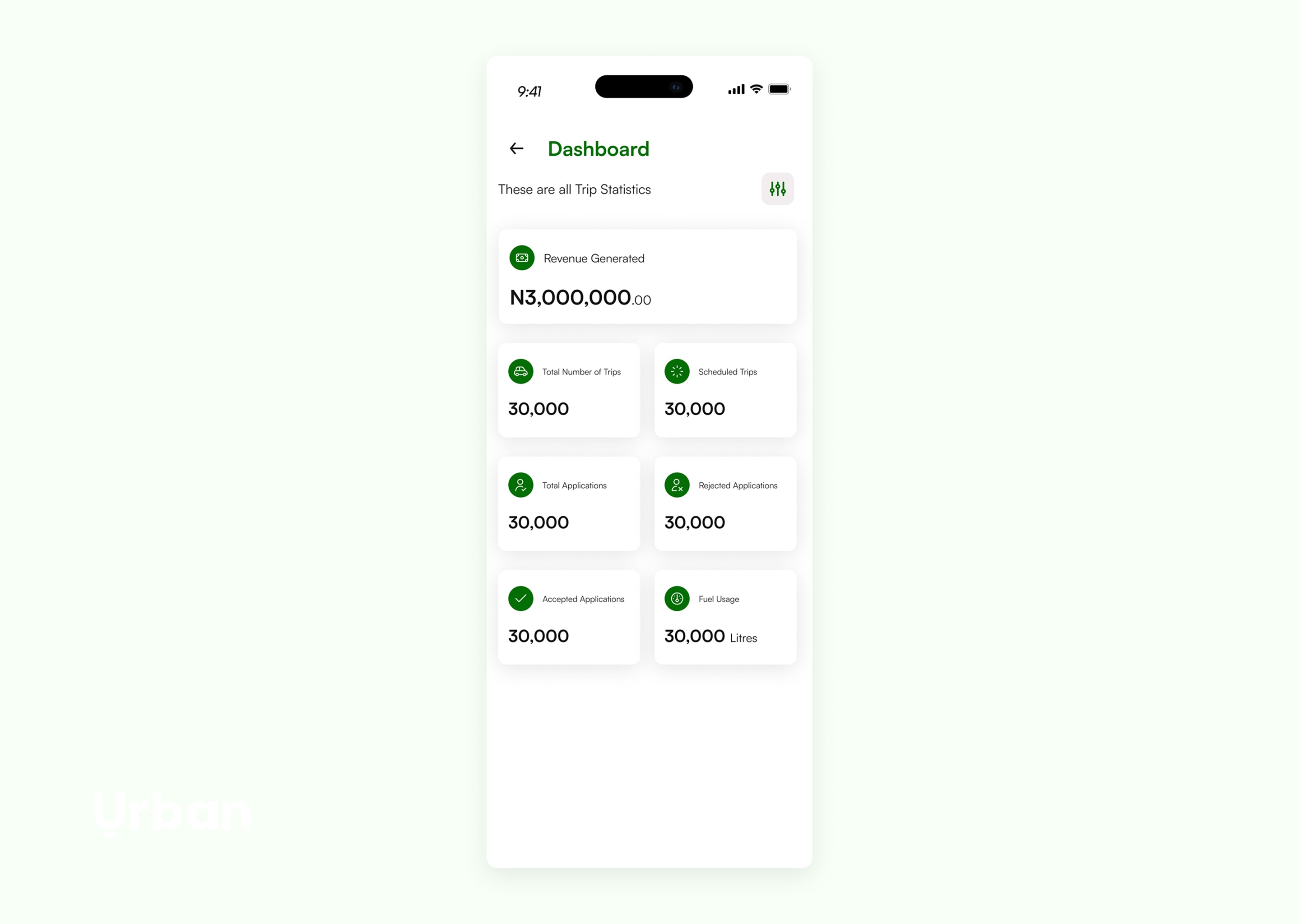
Stripping vanity metrics from the dashboard
The old dashboard was a wall of cards: revenue, total trips, scheduled trips, total applications, rejected applications, accepted applications. I asked a simple question of each one, what use is this to the driver? A driver employed by an agency does not need to stare at their count of rejected applications. It is noise that does nothing for them.
So I unified total, rejected, and accepted applications into a single acceptance rate, one number that tells a driver how successful they are at winning the trips they bid for, with a chart underneath to show the breakdown. I added a fuel-usage chart, hours traveled per week, completed trips, and folded the agency and vehicle information behind a clear "view vehicle" action. The dashboard went from a data dump to a few things a driver can actually use.
Designing for the real risks of Nigerian road travel
Interstate travel here carries risks that a generic ride-hailing design never accounts for. I designed for them directly:
An SOS button, one tap from the home screen. Under genuine duress, no one navigates three menus deep. It had to be immediate. On activation, the driver's location goes to the relevant authorities and to Urban, so help can be directed to a real place. It is not a complete solution, it still depends on Nigeria's emergency response, but it is a real step where there was none.
Driver and vehicle details surfaced to the rider. The old design hid them, which is a security and liability hole. If a third party can walk into a park, pose as an Urban driver, and leave with passengers, that is a serious risk. Showing verified driver and car details closes it.
Particulars accessible in-app. Checkpoint officials sometimes seize a driver's physical particulars to extort them. Having the documents in the app does not stop the stop, but it changes the leverage. I made them easy to reach from the homepage.
A hide-wallet-balance toggle for trips, gated behind biometrics or a password, designed for the reality of roadside robbery on long routes. Hiding a balance is not an obvious feature. It comes from understanding where and how drivers are actually vulnerable.
None of these come from a UI pattern library. They come from understanding the operating environment, which is exactly the kind of domain knowledge that does not transfer to a foreign competitor or a generalist.
I also fleshed out the full driver onboarding to collect the information the operation actually needs, added a rider-review system that feeds back into driver performance and lets fleet owners see who is excelling and who needs work, and built out the settings the original lacked entirely, including login and security, because without it a driver had no way to recover their account.
The Rider Side: Reimagining the Booking
The rider experience needed the journey from "I want to travel" to "my seat is booked" rebuilt.
Booking that respects how travel actually works
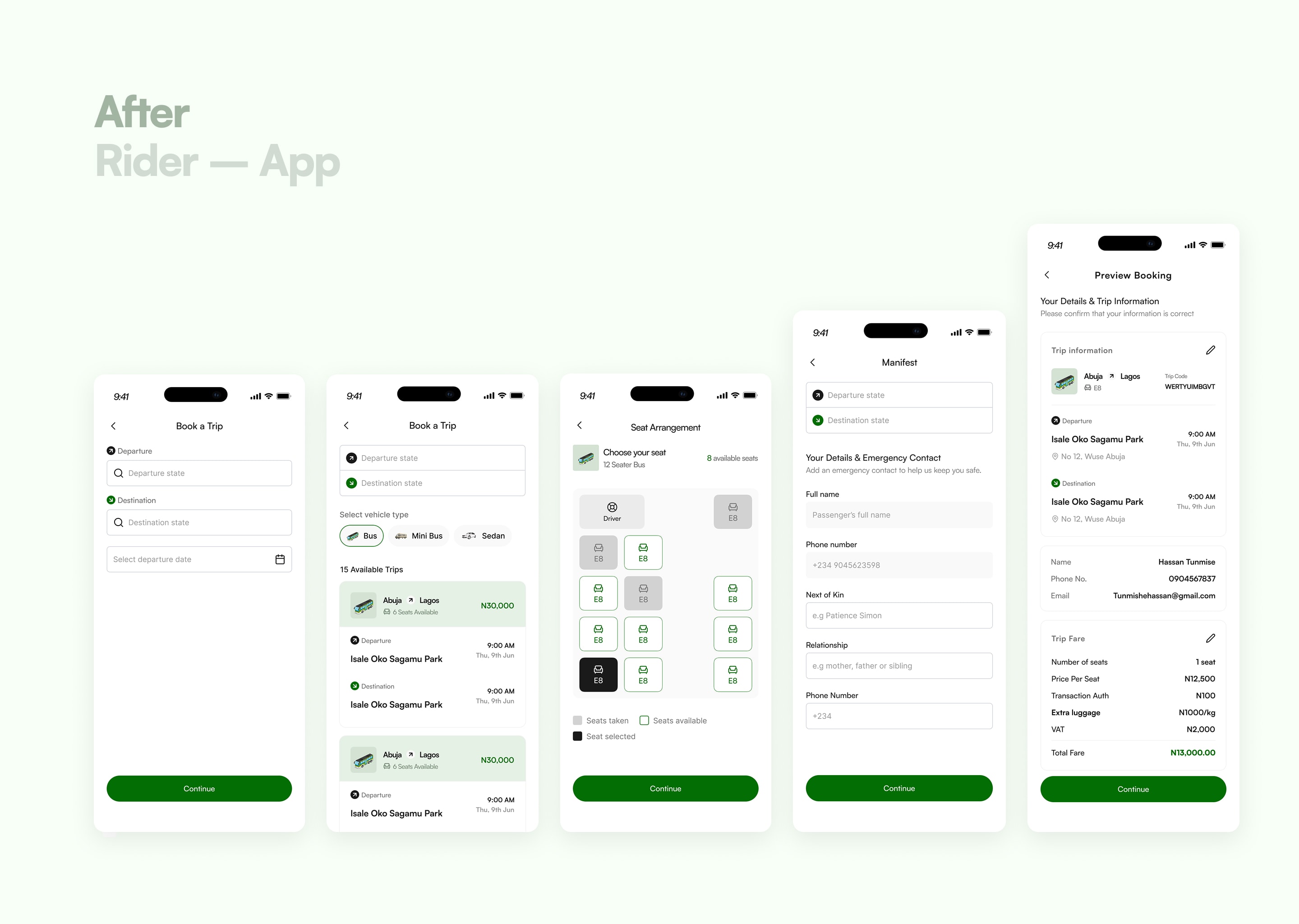
The old booking was thin: pick a departure state, a destination state, a date. No map, no smart input, no sense of the route. I rebuilt it around how interstate travel actually happens.
First, I added vehicle-type choice. On long routes, a seat in a smaller car costs more because it is more comfortable and carries fewer people, while a larger bus subsidizes the cost across more passengers. So a rider selects bus, mini-bus, or sedan, and search returns the trips matching their departure, destination, and vehicle type.
Then the park-versus-city decision, which is the call I am most confident in. Their design showed only city to city. But there are multiple parks in a single city, and a vague "Abuja" means a rider books and only afterward discovers the park is across town, or that Urban does not actually serve their area. So my trip cards show state to state, the price, seats available, and the specific departure and destination parks. Now a rider knows which route the car runs, which park is closest to them, and where along the route they can be picked up or dropped off.
Reducing steps without losing safety
I cut the booking down while keeping the things that protect people:
A seat-arrangement visualizer, showing the real layout of the vehicle, which seats are taken, which are free, and how many remain, with a clear legend.
A reusable manifest. Physical parks collect next-of-kin details in case of emergency. I kept that, but made it a one-time fill that saves for future trips. Name and phone pull from the account, so the rider only adds next-of-kin name, relationship, and number once.
Upfront extra-luggage pricing. The client wanted luggage weighed and charged at the park. I pushed back, because springing a cost on someone at departure is a bad experience. I surfaced extra-luggage pricing inside booking so the full cost is visible before payment, not sprung at the gate.
A segmented booking summary, split into trip information, traveler details, and cost, so a dense confirmation screen becomes easy to read, with the exact park location linkable to Google Maps.
Designing for failure
Because of the architecture I was working within, I had to preempt the ways a booking can break.
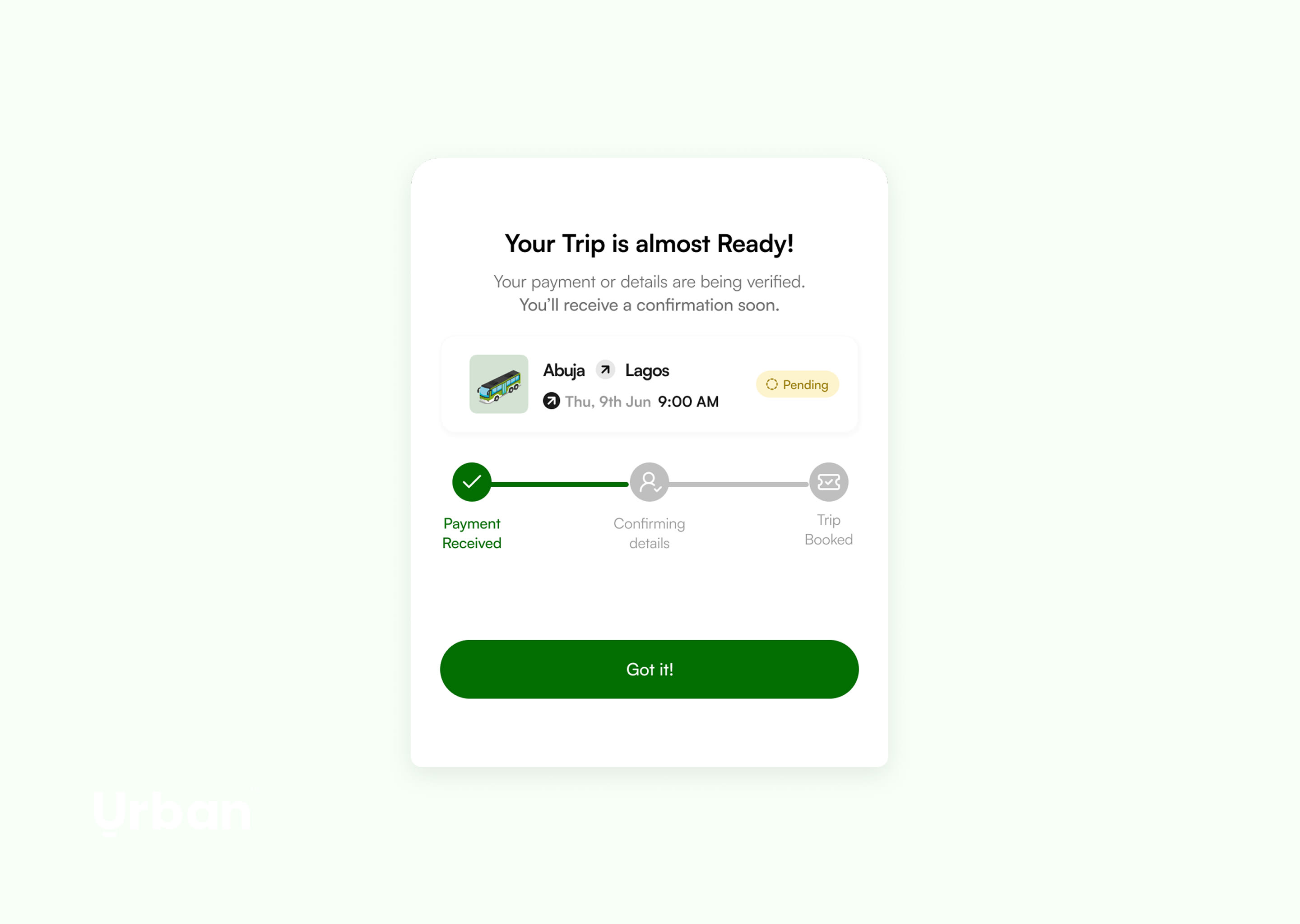
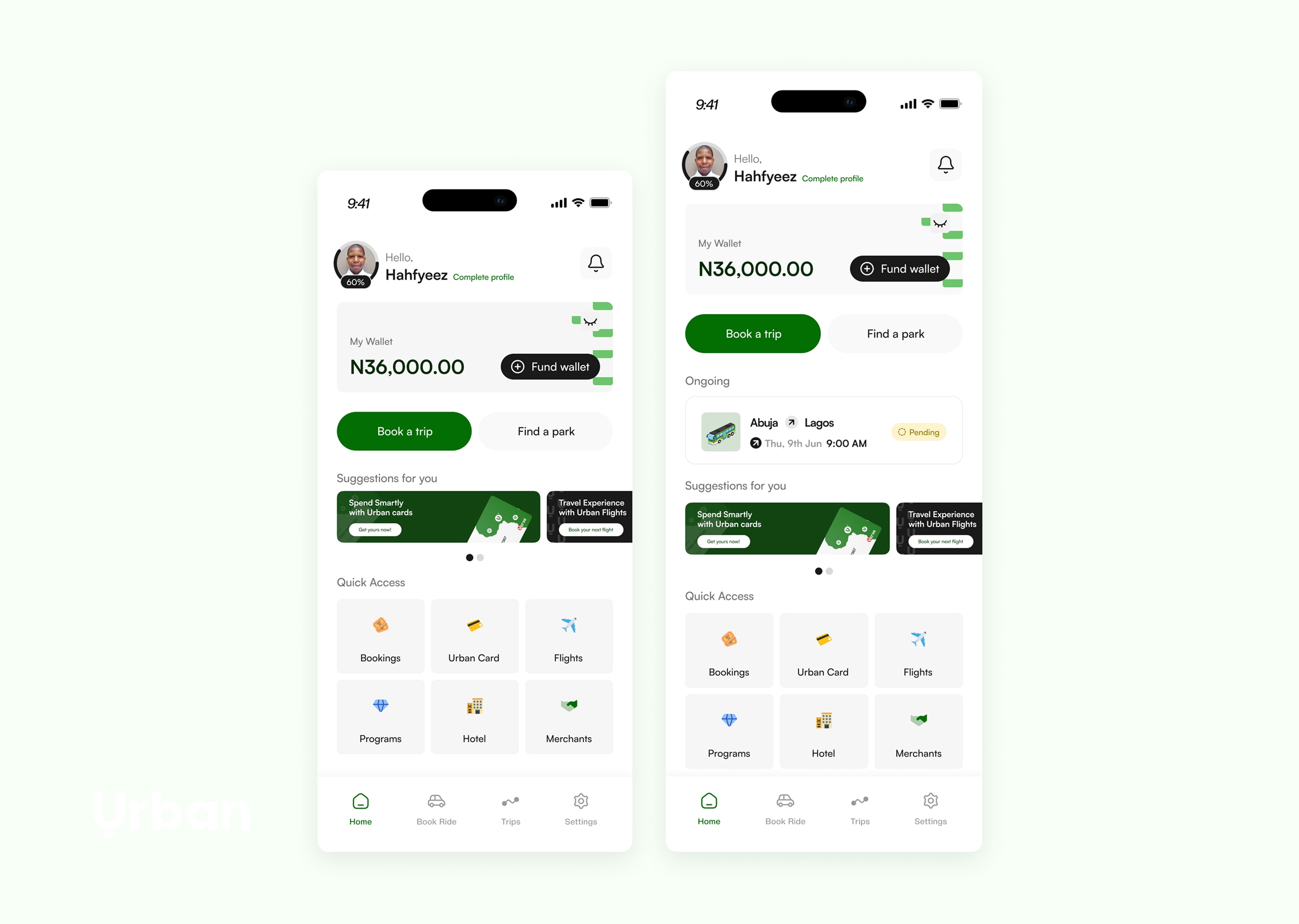
What happens if the payment processor stalls mid-transaction? I added a pending-trip card that stays on the rider's homepage. Tapping it opens a small status model, payment received, confirming details, trip booked, so the rider can see exactly where their booking stands instead of staring at uncertainty after sending money.
And what happens if two riders book the same seat? I raised this as an edge case. Having built products since, I would now name it directly as a race condition and an idempotency problem. The pending-and-confirm pattern helps handle it, and it surfaces the design question underneath: is the operation willing to reassign a seat, and if so, how does the rider get told and rerouted? I designed the reassurance layer and flagged the concurrency decision for the team to confirm technically, rather than pretend I had solved their backend.
That instinct, to design for the unhappy path, came directly from having built. It is the clearest example of how being AI-native and hands-on with code feeds back into sharper product decisions.
The homepage as a guide
The old homepage gave no direction. I rebuilt it around priority: three actions ranked by intent, book a trip first, then find a park, then fund wallet, with the wallet balance visible and fundable on the screen. I added a marketing section for their other products (Urban Cards, Urban Flights, installment plans) as clean cards, plus quick-access shortcuts. I also designed the card-creation flow, the KYC and identity-verification onboarding, and redesigned the flights experience, which ties into their installment plan.
What Shipped
Urban went live in 2026. The team found the redesign refreshing and simpler than what they had, and it shipped without forcing a costly rebuild of their architecture, which was the whole constraint.
What I delivered:
A unified design system across the driver and rider apps, where there had been two mismatched experiences.
A driver experience rebuilt around how the fleet operation actually runs, with the navigation collapsed from a fragmented five-tab structure to a clear four-tab lifecycle.
A security suite designed for the specific risks of Nigerian interstate travel.
A rebuilt rider booking flow that respects routes, parks, and the unhappy paths of payment and seat assignment.
All of it designed to fit the existing system, not to detonate it.
Why This Matters for Mobility and Fleet Operations
Urban is fleet operations. Drivers on shift, agencies scheduling trips and assigning vehicles, fleet owners tracking performance, fuel logged across a journey, all of it needing to stay legible to the people running it day to day.
The skill on show is taking a tangled, multi-actor mobility operation and making it make sense, for the driver, the rider, the agency, and the fleet owner, without rebuilding the engine underneath. That is the exact problem fleet and mobility platforms exist to solve: many parties, one operation, real constraints, and a system that has to stay coherent while it runs.
I am a product designer who is AI-native and builds. On Urban, the building showed up as judgment, designing for race conditions and payment failures because I have hit them myself, while staying disciplined about a system I was not free to rewrite.
4goeF<E
WANT SOMETHING LIKE THIS?
Every project starts with a conversation. Let's talk about what you're building.